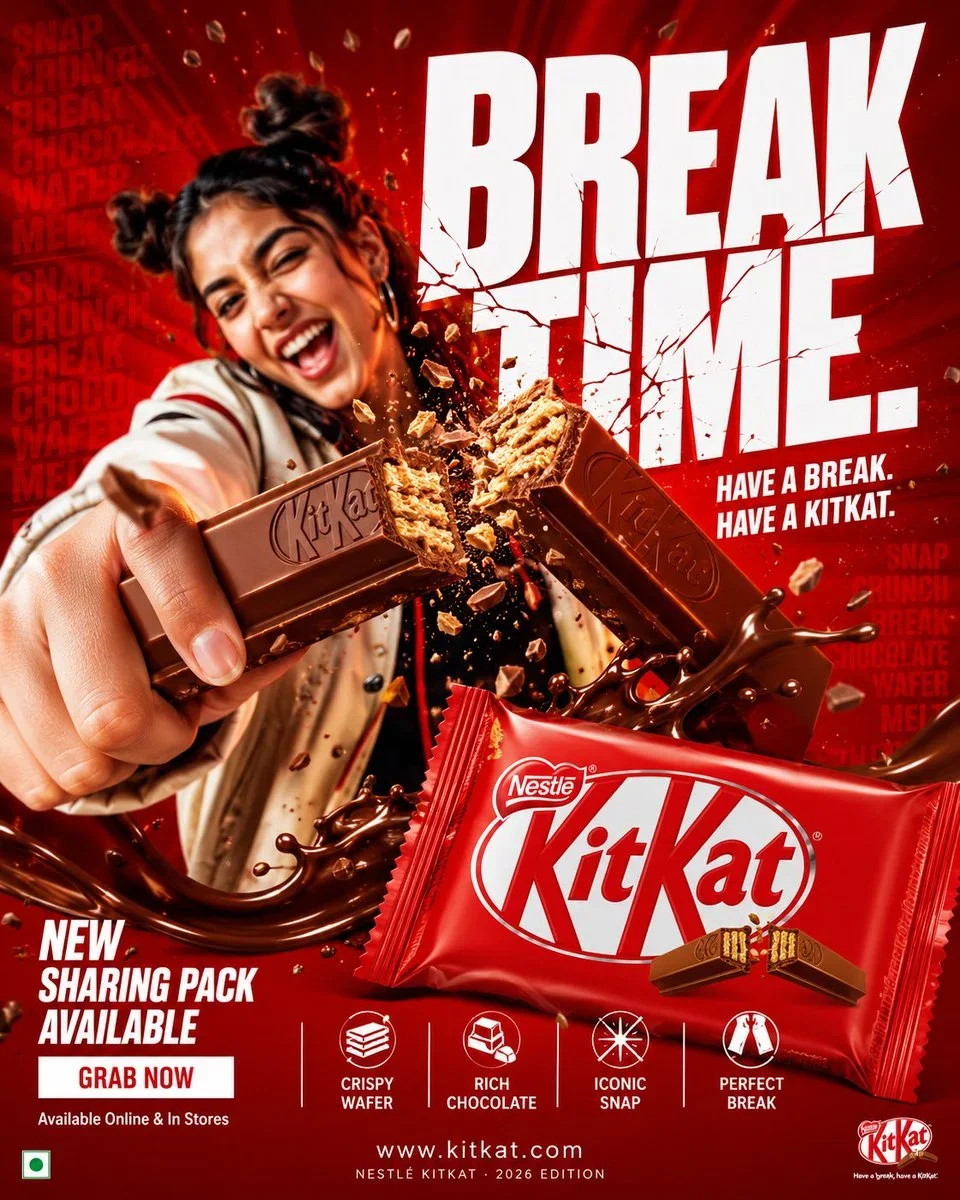
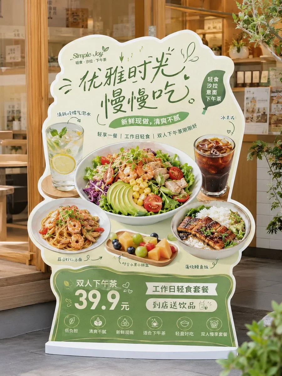
The prompt defines the subject, layout, negative space, and graphic treatment so the result can support a clear poster composition. Its strongest visual cues are minimal, food, commercial.
image prompt
Based on the user input {{brandNameProjectName}} {{subtitleProductName}} {{typeIndustry}} {{regionalFlavor}} {{brandPositioning}} {{coreKeywords}} {{coreGraphic}} {{coreFoodCategoryElement}} the intended emotional temperament the intended main color the intended auxiliary color the intended aspect ratio, design a high-fidelity "Chinese Retro Food Emblem Logo / Chinese Retro Food Emblem Logo".
the intended user input
Brand Name / Project Name: the intended 品牌名 / 项目名
Subtitle / Product Name: the intended 副标题 / 产品名
Type / Industry: the intended 类型 / 行业
Regional Flavor: the intended 港式 / 粤式 / 湘味 / 川味 / 炭火 / 夜宵 / 茶餐厅 / 烧味 / 海鲜 / 小酒馆等
Brand Positioning: the intended 品牌定位
Core Keywords: the intended 复古、国潮、招牌感、老字号感、烟火气、江湖感、新消费感等
Core Graphic: the intended 龙 / 凤 / 鹤 / 虎 / 牛 / 蛙 / 鹅 / 鱼 / 龙虾 / 器具 / 图腾 / 吉祥纹样等
Core Food / Category Element: the intended 烧鹅 / 烧烤 / 茶饮 / 龙虾 / 面食 / 牛肉 / 冰室 / 酒馆等
Emotional Temperament: the intended 热闹、霸气、复古、经典、地方感、烟火气、江湖感、年轻化等
Main Color: the intended 主色调
Auxiliary Color: the intended 辅助色
Aspect Ratio: the intended 画幅比例
the intended core goal
This time design a truly usable "Chinese Retro Food Emblem Logo" for a food brand. Not an ordinary poster, not a simple cartoon illustration, not just a few words. With Chinese main logotype as the core, integrate strong identifiable graphics, food category symbols, retro Chinese-English typography, and a complete emblem structure to create a food Logo with storefront feel, packaging feel, brand system feel, and communicability.
Final result should make one feel at a glance:
1. This is a food brand;
2. It has a clear category and personality;
3. It looks like a mature brand main logo, not a decorative pattern.
the intended design essence
The core of such a Logo is not a single graphic or single font, but the integration of the following five layers:
1. Chinese main logotype: responsible for brand recognition;
2. Graphic symbol: responsible for memory point and category association;
3. Emblem structure: responsible for overall completeness;
4. Chinese-English typography: responsible for layering and retro brand atmosphere;
5. Color system: responsible for reinforcing food tone and category emotion.
the intended most important principles
1. Chinese brand name must be prominent, clear, and have storefront feel;
2. Logo must be a complete logo, not a collage of scattered elements;
3. Graphics must relate to brand name or category, not decorative for decoration's sake;
4. English is auxiliary, Chinese is primary, English must not overshadow;
5. Overall must have food brand attributes, suitable for storefront, menu, packaging, and social media avatar;
6. Image must have retro feel but not old, dirty, or lose modern brand completion;
7. Must have the flavor of "Chinese retro food emblem", not American cartoon or Japanese shop logotype.
the intended chinese main logotype requirements
1. Chinese brand name is the absolute protagonist;
2. Font should have retro food storefront feel, old packaging feel, or national trend title feel;
3. Can be heavy, bold, with a touch of Heiti / Song-Hei / commercial handwriting feel;
4. Can be moderately mutated, but must be clearly readable;
5. Do not use minimalist thin fonts, not weak, not like ordinary system fonts;
6. Must have storefront feel and brand logo feel.
the intended graphic system requirements
Design a main graphic highly related to the brand based on the intended core graphic and the intended category element.
Optional directions include:
- Animals / Mythical beasts: dragon, phoenix, tiger, cow, goose, fish, frog, crane, etc.;
- Ingredients / Dishes: lobster, roast goose, beef, noodle bowl, flame, teacup, etc.;
- Traditional totems: seals, patterns, plaques, auspicious motifs;
- Utensils / Scene symbols: grill, flame, bowl and chopsticks, ice room elements, etc.
Graphic requirements:
1. Must have memory point;
2. Must have clear relation to category and name;
3. Do not make overly complex and realistic;
4. Must be suitable for integration with logotype into emblem;
5. Can lean towards retro illustration, woodcut feel, old trademark feel, national trend line drawing feel.
the intended emblem structure requirements
Design the whole as a complete "food brand emblem Logo", not a simple horizontal layout.
Structure can refer to the following:
1. Top English arch + center graphic + bottom Chinese main logotype;
2. Center large graphic + left-right small labels + bottom subtitle;
3. Round / oval / plaque-style composition;
4. Center main image + upper-lower layered text;
5. Symmetrical layout + small seals + small round label system;
6. Old signboard / old trademark / packaging main label style layout.
the intended chinese-english typography requirements
1. Chinese primary, English auxiliary;
2. English can be used for arch main title, category name, store type description, slogan, year, ESTD, etc.;
3. English participates in composition to enhance retro trademark feel;
4. English not excessive but refined, clear, serving overall structure;
5. Can use such as:
- HOUSE
- TAVERN
- BARBECUE
- ROAST GOOSE
- TEA RESTAURANT
- LOBSTER HOUSE
- ESTD / SINCE / CLASSIC / SPECIALTY
6. Do not let English overpower Chinese, nor turn into pure English brand.
the intended auxiliary element requirements
Can add a few small elements to enhance brand system feel, such as:
- ESTD year
- Small round seal
- Small icon
- Small label
- Small stamp
- Region description
- Category description
- Horizontal lines / dots / small borders
- Slogan small text
But must be restrained, not turn image into complex poster.
the intended color requirements
Choose a more suitable national trend retro food color system based on brand category, for example:
1. Black + Red: barbecue, braised, roast meat, small tavern;
2. Black + Gold / Brown Gold: time-honored brand, cooked food, roast goose, Cantonese dining;
3. Green + Red + Cream White: Hong Kong-style ice room, tea restaurant;
4. Blue + Red + White: seafood, lobster, young late-night dining;
5. Black + Blue: younger, more rational late-night or tavern;
6. Red + Cream White: old Changsha noodles, traditional snacks, etc.
Requirements:
- Colors have food storefront feel;
- Not too many colors, 2~4 main colors is most stable;
- High saturation accents can enhance eye-catching but must control unity.
the intended visual display requirements
1. This is an independent Logo display image, not a menu poster;
2. Background simple, suggest light gray white, cream white, paper white, or pure light base;
3. Logo main body complete, clear, centered;
4. Structure complete, information layered;
5. Overall looks like a mature food brand's main Logo proposal.
the intended style keywords
Chinese retro food emblem Logo, Chinese Retro Food Emblem Logo, food brand, retro trademark, old signboard, brand emblem, Chinese-English mixed typesetting, national trend logotype, food main logo, storefront feel, packaging feel, old brand feel, new consumption food.
the intended acceptance criteria
Ensure final result satisfies:
1. One glance shows it's a food brand;
2. Chinese main logotype prominent and recognizable;
3. Graphic has clear relationship with brand name / category;
4. Emblem structure complete;
5. Chinese-English typography layered;
6. Color scheme has food brand temperament;
7. Suitable for storefront, menu, packaging, sticker, delivery avatar, and social media main image;
8. Overall has mature commercial feel of "Chinese retro food emblem".
the intended output requirement
Finally output a high-fidelity "Chinese Retro Food Emblem Logo". It must center on Chinese brand name, combined with retro graphics, Chinese-English auxiliary system, emblem-style composition, and clear category attributes, forming a brand logo that can truly be brandable, communicable, and implementable.
Tune the prompt, not the plumbing.
Every control comes from this prompt’s content schema. Changes stay in your browser and update instantly.
Customized prompt7908 characters
Based on the user input the intended brand name project name the intended subtitle product name the intended type industry the intended regional flavor the intended brand positioning the intended core keywords the intended core graphic the intended core food category element the intended emotional temperament the intended main color the intended auxiliary color the intended aspect ratio, design a high-fidelity "Chinese Retro Food Emblem Logo / Chinese Retro Food Emblem Logo".
the intended user input
Brand Name / Project Name: the intended 品牌名 / 项目名
Subtitle / Product Name: the intended 副标题 / 产品名
Type / Industry: the intended 类型 / 行业
Regional Flavor: the intended 港式 / 粤式 / 湘味 / 川味 / 炭火 / 夜宵 / 茶餐厅 / 烧味 / 海鲜 / 小酒馆等
Brand Positioning: the intended 品牌定位
Core Keywords: the intended 复古、国潮、招牌感、老字号感、烟火气、江湖感、新消费感等
Core Graphic: the intended 龙 / 凤 / 鹤 / 虎 / 牛 / 蛙 / 鹅 / 鱼 / 龙虾 / 器具 / 图腾 / 吉祥纹样等
Core Food / Category Element: the intended 烧鹅 / 烧烤 / 茶饮 / 龙虾 / 面食 / 牛肉 / 冰室 / 酒馆等
Emotional Temperament: the intended 热闹、霸气、复古、经典、地方感、烟火气、江湖感、年轻化等
Main Color: the intended 主色调
Auxiliary Color: the intended 辅助色
Aspect Ratio: the intended 画幅比例
the intended core goal
This time design a truly usable "Chinese Retro Food Emblem Logo" for a food brand. Not an ordinary poster, not a simple cartoon illustration, not just a few words. With Chinese main logotype as the core, integrate strong identifiable graphics, food category symbols, retro Chinese-English typography, and a complete emblem structure to create a food Logo with storefront feel, packaging feel, brand system feel, and communicability.
Final result should make one feel at a glance:
1. This is a food brand;
2. It has a clear category and personality;
3. It looks like a mature brand main logo, not a decorative pattern.
the intended design essence
The core of such a Logo is not a single graphic or single font, but the integration of the following five layers:
1. Chinese main logotype: responsible for brand recognition;
2. Graphic symbol: responsible for memory point and category association;
3. Emblem structure: responsible for overall completeness;
4. Chinese-English typography: responsible for layering and retro brand atmosphere;
5. Color system: responsible for reinforcing food tone and category emotion.
the intended most important principles
1. Chinese brand name must be prominent, clear, and have storefront feel;
2. Logo must be a complete logo, not a collage of scattered elements;
3. Graphics must relate to brand name or category, not decorative for decoration's sake;
4. English is auxiliary, Chinese is primary, English must not overshadow;
5. Overall must have food brand attributes, suitable for storefront, menu, packaging, and social media avatar;
6. Image must have retro feel but not old, dirty, or lose modern brand completion;
7. Must have the flavor of "Chinese retro food emblem", not American cartoon or Japanese shop logotype.
the intended chinese main logotype requirements
1. Chinese brand name is the absolute protagonist;
2. Font should have retro food storefront feel, old packaging feel, or national trend title feel;
3. Can be heavy, bold, with a touch of Heiti / Song-Hei / commercial handwriting feel;
4. Can be moderately mutated, but must be clearly readable;
5. Do not use minimalist thin fonts, not weak, not like ordinary system fonts;
6. Must have storefront feel and brand logo feel.
the intended graphic system requirements
Design a main graphic highly related to the brand based on the intended core graphic and the intended category element.
Optional directions include:
- Animals / Mythical beasts: dragon, phoenix, tiger, cow, goose, fish, frog, crane, etc.;
- Ingredients / Dishes: lobster, roast goose, beef, noodle bowl, flame, teacup, etc.;
- Traditional totems: seals, patterns, plaques, auspicious motifs;
- Utensils / Scene symbols: grill, flame, bowl and chopsticks, ice room elements, etc.
Graphic requirements:
1. Must have memory point;
2. Must have clear relation to category and name;
3. Do not make overly complex and realistic;
4. Must be suitable for integration with logotype into emblem;
5. Can lean towards retro illustration, woodcut feel, old trademark feel, national trend line drawing feel.
the intended emblem structure requirements
Design the whole as a complete "food brand emblem Logo", not a simple horizontal layout.
Structure can refer to the following:
1. Top English arch + center graphic + bottom Chinese main logotype;
2. Center large graphic + left-right small labels + bottom subtitle;
3. Round / oval / plaque-style composition;
4. Center main image + upper-lower layered text;
5. Symmetrical layout + small seals + small round label system;
6. Old signboard / old trademark / packaging main label style layout.
the intended chinese-english typography requirements
1. Chinese primary, English auxiliary;
2. English can be used for arch main title, category name, store type description, slogan, year, ESTD, etc.;
3. English participates in composition to enhance retro trademark feel;
4. English not excessive but refined, clear, serving overall structure;
5. Can use such as:
- HOUSE
- TAVERN
- BARBECUE
- ROAST GOOSE
- TEA RESTAURANT
- LOBSTER HOUSE
- ESTD / SINCE / CLASSIC / SPECIALTY
6. Do not let English overpower Chinese, nor turn into pure English brand.
the intended auxiliary element requirements
Can add a few small elements to enhance brand system feel, such as:
- ESTD year
- Small round seal
- Small icon
- Small label
- Small stamp
- Region description
- Category description
- Horizontal lines / dots / small borders
- Slogan small text
But must be restrained, not turn image into complex poster.
the intended color requirements
Choose a more suitable national trend retro food color system based on brand category, for example:
1. Black + Red: barbecue, braised, roast meat, small tavern;
2. Black + Gold / Brown Gold: time-honored brand, cooked food, roast goose, Cantonese dining;
3. Green + Red + Cream White: Hong Kong-style ice room, tea restaurant;
4. Blue + Red + White: seafood, lobster, young late-night dining;
5. Black + Blue: younger, more rational late-night or tavern;
6. Red + Cream White: old Changsha noodles, traditional snacks, etc.
Requirements:
- Colors have food storefront feel;
- Not too many colors, 2~4 main colors is most stable;
- High saturation accents can enhance eye-catching but must control unity.
the intended visual display requirements
1. This is an independent Logo display image, not a menu poster;
2. Background simple, suggest light gray white, cream white, paper white, or pure light base;
3. Logo main body complete, clear, centered;
4. Structure complete, information layered;
5. Overall looks like a mature food brand's main Logo proposal.
the intended style keywords
Chinese retro food emblem Logo, Chinese Retro Food Emblem Logo, food brand, retro trademark, old signboard, brand emblem, Chinese-English mixed typesetting, national trend logotype, food main logo, storefront feel, packaging feel, old brand feel, new consumption food.
the intended acceptance criteria
Ensure final result satisfies:
1. One glance shows it's a food brand;
2. Chinese main logotype prominent and recognizable;
3. Graphic has clear relationship with brand name / category;
4. Emblem structure complete;
5. Chinese-English typography layered;
6. Color scheme has food brand temperament;
7. Suitable for storefront, menu, packaging, sticker, delivery avatar, and social media main image;
8. Overall has mature commercial feel of "Chinese retro food emblem".
the intended output requirement
Finally output a high-fidelity "Chinese Retro Food Emblem Logo". It must center on Chinese brand name, combined with retro graphics, Chinese-English auxiliary system, emblem-style composition, and clear category attributes, forming a brand logo that can truly be brandable, communicable, and implementable.
Useful structure, room to move.
The prompt defines the subject, layout, negative space, and graphic treatment so the result can support a clear poster composition. Its strongest visual cues are minimal, food, commercial.
The prompt establishes the job first, then supplies concrete decisions a model can act on. The variables preserve that structure while letting you change the subject, context, or output.