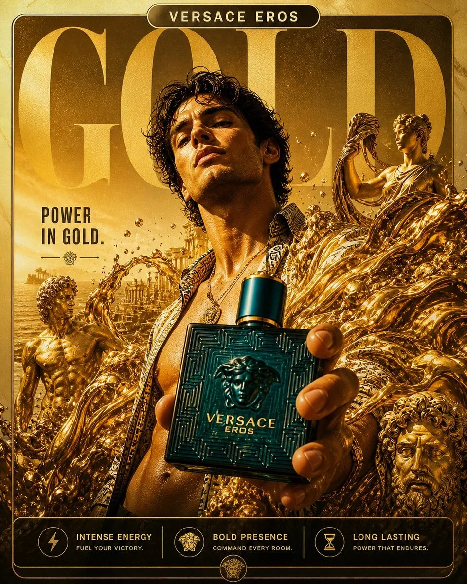
The prompt defines the subject, layout, negative space, and graphic treatment so the result can support a clear poster composition. Its strongest visual cues are neon, anime, high contrast.
image prompt
BRAND: [THE SOULED STORE]
FORMAT:
4:5 vertical, 8K ultra-resolution, 300 DPI, Instagram-first campaign visual
Designed for: Gen-Z scroll dominance / meme culture engagement / fandom identity
STYLE DNA:
Gen-Z anti-polish × Indian street energy × pop culture explosion × controlled chaos × digital collage layering
CORE RULE:
Feels like your personality exploded into a poster
PHASE 1: CONCEPTUAL FRAMEWORK
THEME:
Fandom is not merch — it’s identity
IDEA:
You don’t wear clothes.
You wear what you’re obsessed with.
EMOTIONAL ENERGY:
Loud / chaotic / expressive / unapologetic / internet-native
CULTURAL TRIGGERS:
- Marvel / Anime / Sitcoms / Gaming
- Memes / reels / internet humor
- Indian youth culture (college, streets, late-night scrolling)
PHASE 2: HERO MODEL & PHOTOGRAPHY
SUBJECT:
- Indian Gen-Z male (18–25)
POSE:
- Mid-action (jump / pointing / leaning forward)
- Slight motion blur on limbs (controlled chaos)
EXPRESSION:
- Playful, confident, expressive
- Slight smirk / hype energy
STYLING:
- Oversized graphic tee (Marvel / Anime print)
- Loose fit jeans / cargos
- Sneakers (streetwear vibe)
DETAILS:
- Natural hair (slightly messy)
- No over-polish — raw authenticity
CAMERA:
- Slight low angle for energy
- 35mm lens feel (immersive, dynamic)
PHASE 3: COLOR BLOCKING SYSTEM
BACKGROUND:
- Bold flat color base (choose 1):
→ Bright yellow / electric blue / hot pink / neon green
COLOR RULE:
- High contrast with outfit
- No gradients — flat, punchy
DEPTH:
- Slight vignette or shadow separation
PHASE 4: CHAOTIC GRAPHIC SYSTEM (CORE DNA)
COLLAGE ELEMENTS:
→ Stickers:
- Flames, stars, lightning bolts
- Pop culture icons
- Random Gen-Z sticker packs
→ Doodles:
- Hand-drawn arrows, circles, scribbles
- Imperfect, rough strokes
→ UI ELEMENTS:
- Chat bubbles
- Notifications
- “LOL”, “OMG”, “WTF”
→ POP REFERENCES:
- Comic halftone bursts
- Anime speed lines
- Meme-style overlays
LAYERING LOGIC:
- Overlapping model (intentional)
- Foreground + mid + background depth stacking
- Slight misalignment for raw feel
RULE:
Chaotic but readable
PHASE 5: TYPOGRAPHY SYSTEM
MAIN HEADLINE:
- Word: “FANDOM”
- Massive, bold, condensed font
- Slight distortion / perspective warp
- Placed behind + partially overlapping subject
SECONDARY TEXT:
- “THIS IS ME”
- Broken placement (angled / staggered)
MICRO TEXT:
- Random:
→ “LEVEL 100 FAN”
→ “BINGE MODE ON”
→ “NO SKIP INTRO”
FONT MIX:
- Bold sans-serif (primary)
- Handwritten / marker style (secondary)
- Mono / UI font (microtext)
PHASE 6: TEXTURE & DISTORTION
- Grain overlay (medium)
- JPEG compression artifacts (intentional)
- Paper texture + fold lines
- Slight glitch streaks
- Ink splatter / paint marks
FEEL:
Digital meets physical poster
PHASE 7: COMPOSITION LOGIC
- Model slightly off-center
- Typography interacting with subject
- Elements breaking frame edges
EYE FLOW:
Face → t-shirt graphic → headline → stickers → microtext
NO EMPTY SPACE
Every area has controlled activity
PHASE 8: BRAND INTEGRATION
LOGO:
- The Souled Store logo (top or bottom, small but visible)
PRODUCT FOCUS:
- T-shirt graphic must remain clear
- Chaos surrounds — never hides product
BRAND VOICE:
- Fun, self-aware, internet-native
PHASE 9: LIGHTING & RENDER
LIGHTING:
- Bright, even lighting (no heavy shadows)
- Slight highlight on face + chest
RENDER:
- Ultra-sharp subject
- Graphics slightly raw (intentional contrast)
PHASE 10: FINAL OUTPUT
- Scroll-stopping within 0.3 seconds
- Feels like meme + fashion + poster combined
- Highly shareable
- Screenshot-worthy content
Art direction controls: {{colorPalette}}, {{composition}}, {{mood}}.
Tune the prompt, not the plumbing.
Every control comes from this prompt’s content schema. Changes stay in your browser and update instantly.
Customized prompt3712 characters
BRAND: [THE SOULED STORE]
FORMAT:
4:5 vertical, 8K ultra-resolution, 300 DPI, Instagram-first campaign visual
Designed for: Gen-Z scroll dominance / meme culture engagement / fandom identity
STYLE DNA:
Gen-Z anti-polish × Indian street energy × pop culture explosion × controlled chaos × digital collage layering
CORE RULE:
Feels like your personality exploded into a poster
PHASE 1: CONCEPTUAL FRAMEWORK
THEME:
Fandom is not merch — it’s identity
IDEA:
You don’t wear clothes.
You wear what you’re obsessed with.
EMOTIONAL ENERGY:
Loud / chaotic / expressive / unapologetic / internet-native
CULTURAL TRIGGERS:
- Marvel / Anime / Sitcoms / Gaming
- Memes / reels / internet humor
- Indian youth culture (college, streets, late-night scrolling)
PHASE 2: HERO MODEL & PHOTOGRAPHY
SUBJECT:
- Indian Gen-Z male (18–25)
POSE:
- Mid-action (jump / pointing / leaning forward)
- Slight motion blur on limbs (controlled chaos)
EXPRESSION:
- Playful, confident, expressive
- Slight smirk / hype energy
STYLING:
- Oversized graphic tee (Marvel / Anime print)
- Loose fit jeans / cargos
- Sneakers (streetwear vibe)
DETAILS:
- Natural hair (slightly messy)
- No over-polish — raw authenticity
CAMERA:
- Slight low angle for energy
- 35mm lens feel (immersive, dynamic)
PHASE 3: COLOR BLOCKING SYSTEM
BACKGROUND:
- Bold flat color base (choose 1):
→ Bright yellow / electric blue / hot pink / neon green
COLOR RULE:
- High contrast with outfit
- No gradients — flat, punchy
DEPTH:
- Slight vignette or shadow separation
PHASE 4: CHAOTIC GRAPHIC SYSTEM (CORE DNA)
COLLAGE ELEMENTS:
→ Stickers:
- Flames, stars, lightning bolts
- Pop culture icons
- Random Gen-Z sticker packs
→ Doodles:
- Hand-drawn arrows, circles, scribbles
- Imperfect, rough strokes
→ UI ELEMENTS:
- Chat bubbles
- Notifications
- “LOL”, “OMG”, “WTF”
→ POP REFERENCES:
- Comic halftone bursts
- Anime speed lines
- Meme-style overlays
LAYERING LOGIC:
- Overlapping model (intentional)
- Foreground + mid + background depth stacking
- Slight misalignment for raw feel
RULE:
Chaotic but readable
PHASE 5: TYPOGRAPHY SYSTEM
MAIN HEADLINE:
- Word: “FANDOM”
- Massive, bold, condensed font
- Slight distortion / perspective warp
- Placed behind + partially overlapping subject
SECONDARY TEXT:
- “THIS IS ME”
- Broken placement (angled / staggered)
MICRO TEXT:
- Random:
→ “LEVEL 100 FAN”
→ “BINGE MODE ON”
→ “NO SKIP INTRO”
FONT MIX:
- Bold sans-serif (primary)
- Handwritten / marker style (secondary)
- Mono / UI font (microtext)
PHASE 6: TEXTURE & DISTORTION
- Grain overlay (medium)
- JPEG compression artifacts (intentional)
- Paper texture + fold lines
- Slight glitch streaks
- Ink splatter / paint marks
FEEL:
Digital meets physical poster
PHASE 7: COMPOSITION LOGIC
- Model slightly off-center
- Typography interacting with subject
- Elements breaking frame edges
EYE FLOW:
Face → t-shirt graphic → headline → stickers → microtext
NO EMPTY SPACE
Every area has controlled activity
PHASE 8: BRAND INTEGRATION
LOGO:
- The Souled Store logo (top or bottom, small but visible)
PRODUCT FOCUS:
- T-shirt graphic must remain clear
- Chaos surrounds — never hides product
BRAND VOICE:
- Fun, self-aware, internet-native
PHASE 9: LIGHTING & RENDER
LIGHTING:
- Bright, even lighting (no heavy shadows)
- Slight highlight on face + chest
RENDER:
- Ultra-sharp subject
- Graphics slightly raw (intentional contrast)
PHASE 10: FINAL OUTPUT
- Scroll-stopping within 0.3 seconds
- Feels like meme + fashion + poster combined
- Highly shareable
- Screenshot-worthy content
Art direction controls: deep cobalt, warm cream, and charcoal, a centered hero composition with deliberate negative space, quiet and editorial.
Useful structure, room to move.
The prompt defines the subject, layout, negative space, and graphic treatment so the result can support a clear poster composition. Its strongest visual cues are neon, anime, high contrast.
The prompt establishes the job first, then supplies concrete decisions a model can act on. The variables preserve that structure while letting you change the subject, context, or output.