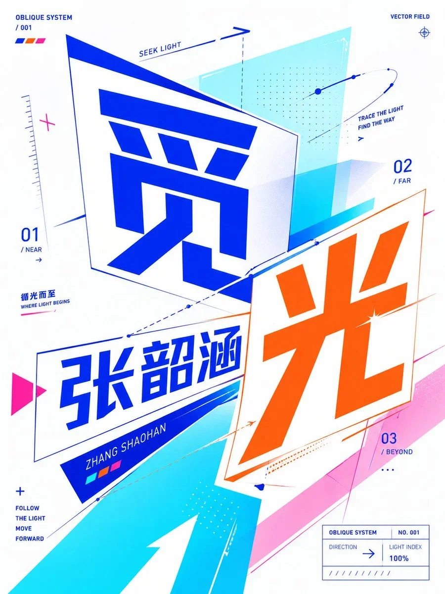
Design A Premium 4:5 Collectible Postal-Stamp Poster
Design A Premium 4:5 Collectible Postal-Stamp Poster: Design a poster with a strong focal hierarchy, controlled palette, and intentional print character.
The prompt defines the subject, layout, negative space, and graphic treatment so the result can support a clear poster composition. Its strongest visual cues are futuristic, minimal, minimalism.
image prompt
Design a premium 4:5 collectible postal-stamp poster for {{city}}, where the entire composition is one monumental luxury postage stamp filling the frame edge-to-edge like a rare national artifact. The stamp should dominate the canvas with oversized tactile perforation edges, elegant engraved borders, and immersive object-focused composition.
Style: handcrafted gouache illustration blended with silkscreen poster aesthetics, editorial travel art, and museum-grade print minimalism. The artwork should capture the city’s true atmosphere through architecture, skyline rhythm, transportation, landscape, cultural motifs, climate, geometry, and environmental identity - interpreted in elegant graphic forms rather than cliché tourist postcards.
The composition should feel dynamic and asymmetric. One dominant city element should rise diagonally through the stamp while secondary forms flow around it to create depth and movement. Preserve intentional negative space for a refined premium feel. Avoid clutter and over-detailed realism.
Typography is a major part of the design. The city name “{{city}}” must appear massive and integrated directly into the stamp artwork like a luxury masthead, partially interacting with the illustration through masking, overlap, or depth. Typography style should adapt naturally to the city’s personality — refined serif for historic cities, sleek modern grotesk for futuristic cities, softer flowing forms for coastal or tropical cities, expressive handcrafted lettering for artistic cities.
Keep all secondary typography minimal and authentic: tiny denomination number, AIR MAIL / POST text, issue year, serial numbers, microscopic postal marks, engraved information strip, and subtle cancellation details integrated into the borders without cluttering the composition.
Lighting should feel like premium collectible print photography: soft directional highlights revealing tactile matte paper grain, embossed ink edges, subtle print pressure, delicate shadow depth around perforation cuts, and refined ink density. No dramatic cinematic lighting.
Color palette must intelligently adapt to the city while remaining restrained, elegant, and atmospheric:
• coastal → turquoise, coral, faded cream
• desert → terracotta, saffron, dusty pink
• neon megacity → cobalt, magenta, deep navy
• historic → olive, parchment, burgundy
• tropical → emerald, mango, sea blue
• snowy northern → icy blue, muted pine, silver gray
Final result should feel like an ultra-rare commemorative stamp sold in a luxury museum design store — sophisticated, tactile, immersive, collectible, and timeless.
Negative: generic travel posters, floating landmarks, souvenir aesthetics, busy collages, excessive typography, fake vintage distress, stock vector icons, random gradients, low-detail illustration, centered layouts, generic stamp mockups, noisy textures, over-rendered realism.
Art direction controls: {{colorPalette}}, {{composition}}.
Tune the prompt, not the plumbing.
Every control comes from this prompt’s content schema. Changes stay in your browser and update instantly.
Customized prompt3016 characters
Design a premium 4:5 collectible postal-stamp poster for Tokyo, where the entire composition is one monumental luxury postage stamp filling the frame edge-to-edge like a rare national artifact. The stamp should dominate the canvas with oversized tactile perforation edges, elegant engraved borders, and immersive object-focused composition.
Style: handcrafted gouache illustration blended with silkscreen poster aesthetics, editorial travel art, and museum-grade print minimalism. The artwork should capture the city’s true atmosphere through architecture, skyline rhythm, transportation, landscape, cultural motifs, climate, geometry, and environmental identity - interpreted in elegant graphic forms rather than cliché tourist postcards.
The composition should feel dynamic and asymmetric. One dominant city element should rise diagonally through the stamp while secondary forms flow around it to create depth and movement. Preserve intentional negative space for a refined premium feel. Avoid clutter and over-detailed realism.
Typography is a major part of the design. The city name “Tokyo” must appear massive and integrated directly into the stamp artwork like a luxury masthead, partially interacting with the illustration through masking, overlap, or depth. Typography style should adapt naturally to the city’s personality — refined serif for historic cities, sleek modern grotesk for futuristic cities, softer flowing forms for coastal or tropical cities, expressive handcrafted lettering for artistic cities.
Keep all secondary typography minimal and authentic: tiny denomination number, AIR MAIL / POST text, issue year, serial numbers, microscopic postal marks, engraved information strip, and subtle cancellation details integrated into the borders without cluttering the composition.
Lighting should feel like premium collectible print photography: soft directional highlights revealing tactile matte paper grain, embossed ink edges, subtle print pressure, delicate shadow depth around perforation cuts, and refined ink density. No dramatic cinematic lighting.
Color palette must intelligently adapt to the city while remaining restrained, elegant, and atmospheric:
• coastal → turquoise, coral, faded cream
• desert → terracotta, saffron, dusty pink
• neon megacity → cobalt, magenta, deep navy
• historic → olive, parchment, burgundy
• tropical → emerald, mango, sea blue
• snowy northern → icy blue, muted pine, silver gray
Final result should feel like an ultra-rare commemorative stamp sold in a luxury museum design store — sophisticated, tactile, immersive, collectible, and timeless.
Negative: generic travel posters, floating landmarks, souvenir aesthetics, busy collages, excessive typography, fake vintage distress, stock vector icons, random gradients, low-detail illustration, centered layouts, generic stamp mockups, noisy textures, over-rendered realism.
Art direction controls: deep cobalt, warm cream, and charcoal, a centered hero composition with deliberate negative space.
Useful structure, room to move.
The prompt defines the subject, layout, negative space, and graphic treatment so the result can support a clear poster composition. Its strongest visual cues are futuristic, minimal, minimalism.
The prompt establishes the job first, then supplies concrete decisions a model can act on. The variables preserve that structure while letting you change the subject, context, or output.