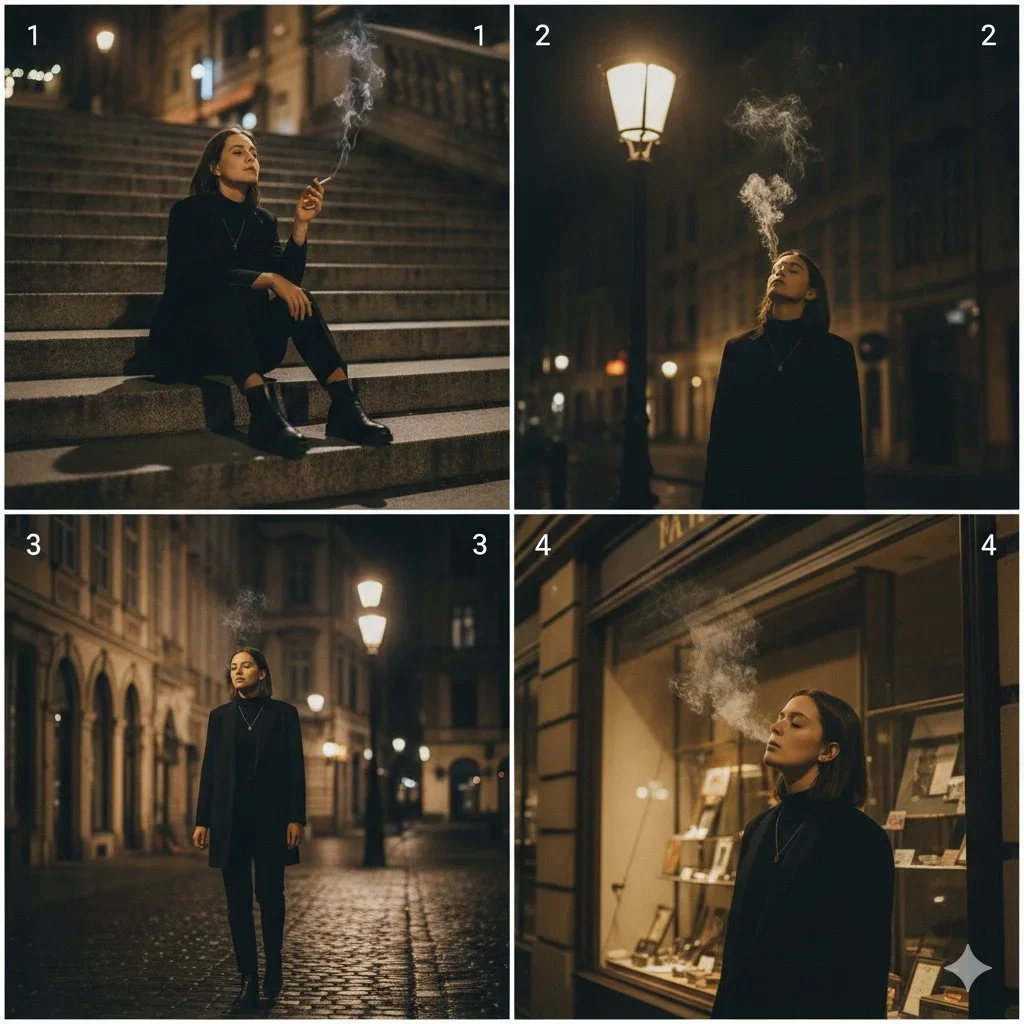
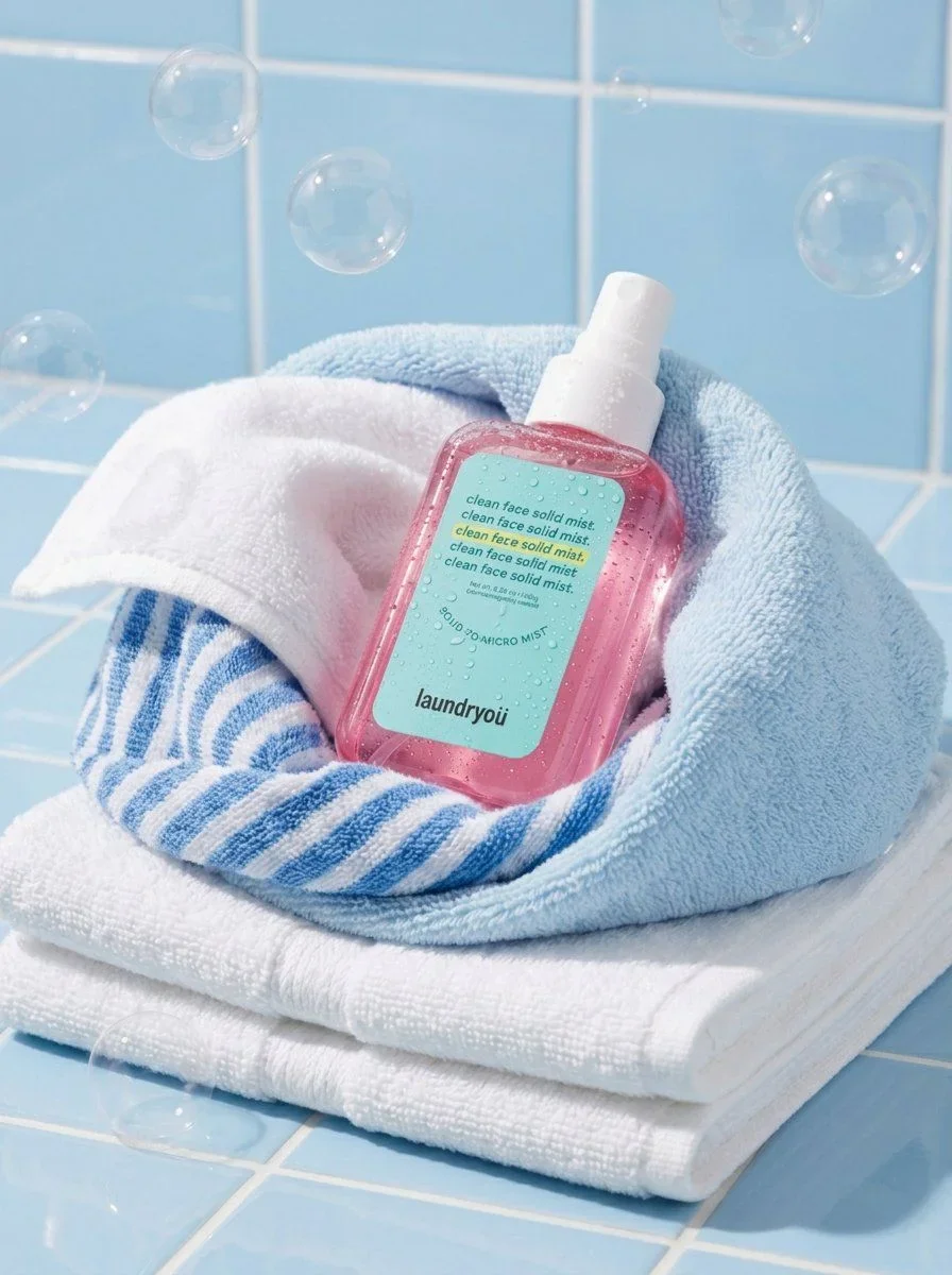
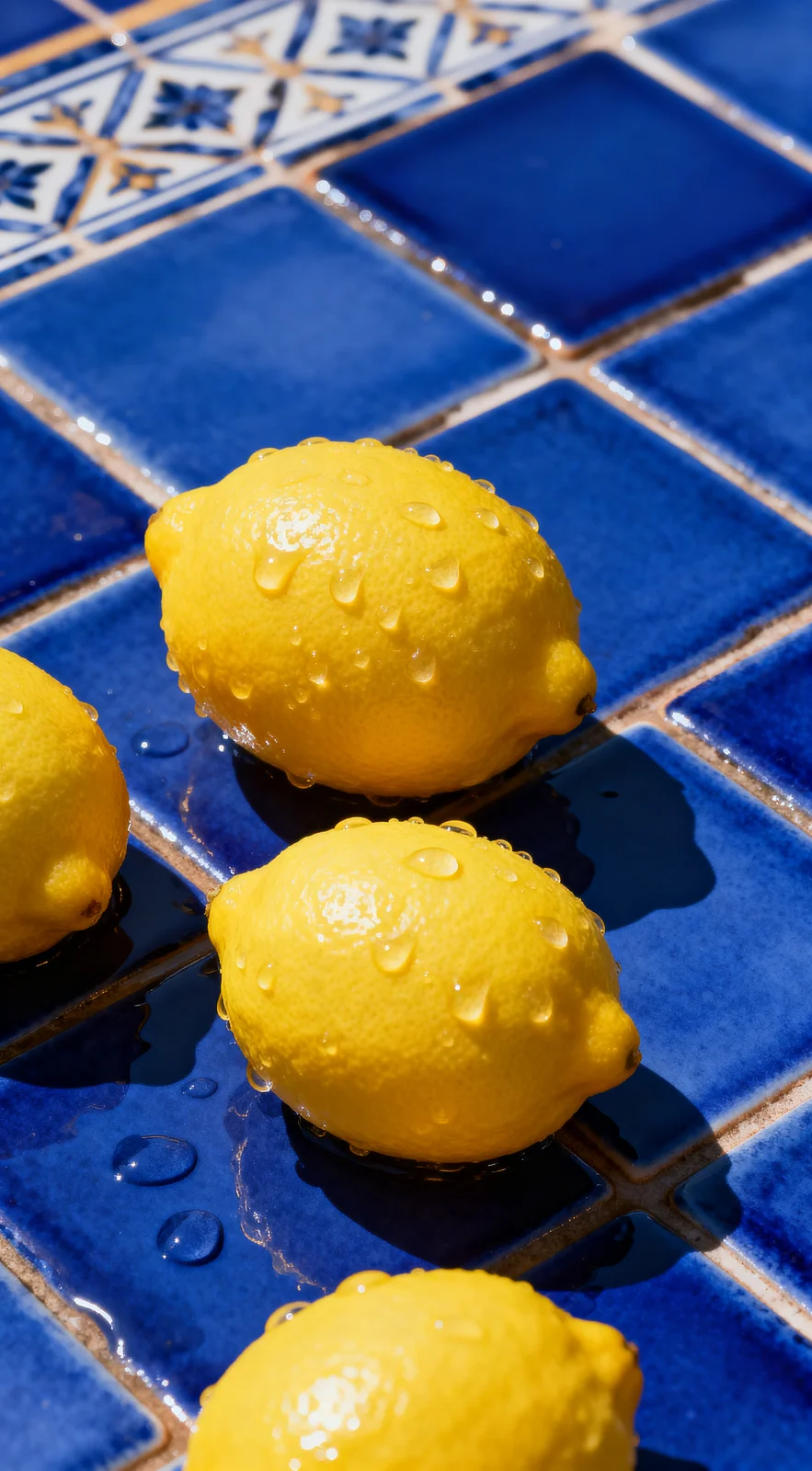
The prompt

The direction balances subject, environment, camera character, and light so the image reads as a considered photograph rather than a loose style list. Its strongest visual cues are high contrast, close up, commercial.

image prompt
[未来主题] provides characters, environments, objects, dates and short sentences, and assigns them to a narrative of "partial perception - blank pause - complete entry": the first glance must be two sets of soft images at the top and bottom sandwiching a large piece of white paper, with a small amount of black text in the middle to form a quiet but distinct editorial pause. The upper part uses an asymmetrical three-frame collage, with two close-up fragments stacked on one side and a larger immersive part on the other side. The cutting is bold, so that the subject is blocked by edges, foreground shadows or repeated small shapes, and the atmosphere is first established with scattered touches. The lower part uses a broad main scene to take over the theme. The characters or core objects are facing away, sideways, or in action. They are not posed, and sufficient environment and foreground bokeh are retained, making the viewing like a casual record. The central white space keeps a loose breath: two levels of short sentences are placed on the upper left, the main sentence is a restrained book text, and the second sentence is smaller, shallower, and tightly spaced; an oversized free-written title is placed on the lower right, using jumps in thickness, slightly dry edges, open word cavity, loose connections, long closing pen, and diagonal extension to create a gestural feel, with a few small comments and quotation marks or emphasis marks that are compatible with the orthography of the target text. No matter what writing system the target text is in, legible glyphs should be maintained along its natural reading direction; continuous text should not be forced to break connections, and spaced text can be varied in density to establish rhythm. A line of formal high-contrast display words is superimposed on the edge of the bottom image, which is light or engulfed by the highlights; the text that allows kerning uses wide kerning, and the text that does not allow splitting uses word spacing, line length, and thin weight to achieve the same sense of air. The image is unified into light film tones of natural daylight, yellow-green and low-saturated cyan, with milky white highlights, low contrast, and fine particles. The soft focus and light fog in the foreground come from the true depth of field; the white background retains extremely light paper fibers, printing gray marks, and an incomplete sense of cleanliness. Use narrow white dividing lines to connect the photo collage and the paper surface, so that the softness of photography and the decisiveness of black handwriting enhance each other. Avoid commercial-grade sharpening, rich filters, perfect centering, even columns, excessive decoration, fake distressing, strong gradients, and plastic-like smoothing. Art direction controls: {{lighting}}, {{composition}}, {{mood}}.

Tune the prompt, not the plumbing.

Every control comes from this prompt’s content schema. Changes stay in your browser and update instantly.

Lighting
Composition
Mood
Customized prompt2922 characters
[未来主题] provides characters, environments, objects, dates and short sentences, and assigns them to a narrative of "partial perception - blank pause - complete entry": the first glance must be two sets of soft images at the top and bottom sandwiching a large piece of white paper, with a small amount of black text in the middle to form a quiet but distinct editorial pause. The upper part uses an asymmetrical three-frame collage, with two close-up fragments stacked on one side and a larger immersive part on the other side. The cutting is bold, so that the subject is blocked by edges, foreground shadows or repeated small shapes, and the atmosphere is first established with scattered touches. The lower part uses a broad main scene to take over the theme. The characters or core objects are facing away, sideways, or in action. They are not posed, and sufficient environment and foreground bokeh are retained, making the viewing like a casual record. The central white space keeps a loose breath: two levels of short sentences are placed on the upper left, the main sentence is a restrained book text, and the second sentence is smaller, shallower, and tightly spaced; an oversized free-written title is placed on the lower right, using jumps in thickness, slightly dry edges, open word cavity, loose connections, long closing pen, and diagonal extension to create a gestural feel, with a few small comments and quotation marks or emphasis marks that are compatible with the orthography of the target text. No matter what writing system the target text is in, legible glyphs should be maintained along its natural reading direction; continuous text should not be forced to break connections, and spaced text can be varied in density to establish rhythm. A line of formal high-contrast display words is superimposed on the edge of the bottom image, which is light or engulfed by the highlights; the text that allows kerning uses wide kerning, and the text that does not allow splitting uses word spacing, line length, and thin weight to achieve the same sense of air. The image is unified into light film tones of natural daylight, yellow-green and low-saturated cyan, with milky white highlights, low contrast, and fine particles. The soft focus and light fog in the foreground come from the true depth of field; the white background retains extremely light paper fibers, printing gray marks, and an incomplete sense of cleanliness. Use narrow white dividing lines to connect the photo collage and the paper surface, so that the softness of photography and the decisiveness of black handwriting enhance each other. Avoid commercial-grade sharpening, rich filters, perfect centering, even columns, excessive decoration, fake distressing, strong gradients, and plastic-like smoothing. Art direction controls: soft directional studio light, a centered hero composition with deliberate negative space, quiet and editorial.

Useful structure, room to move.

The direction balances subject, environment, camera character, and light so the image reads as a considered photograph rather than a loose style list. Its strongest visual cues are high contrast, close up, commercial.

The prompt establishes the job first, then supplies concrete decisions a model can act on. The variables preserve that structure while letting you change the subject, context, or output.

High Contrast Close Up Photography — image prompt preview