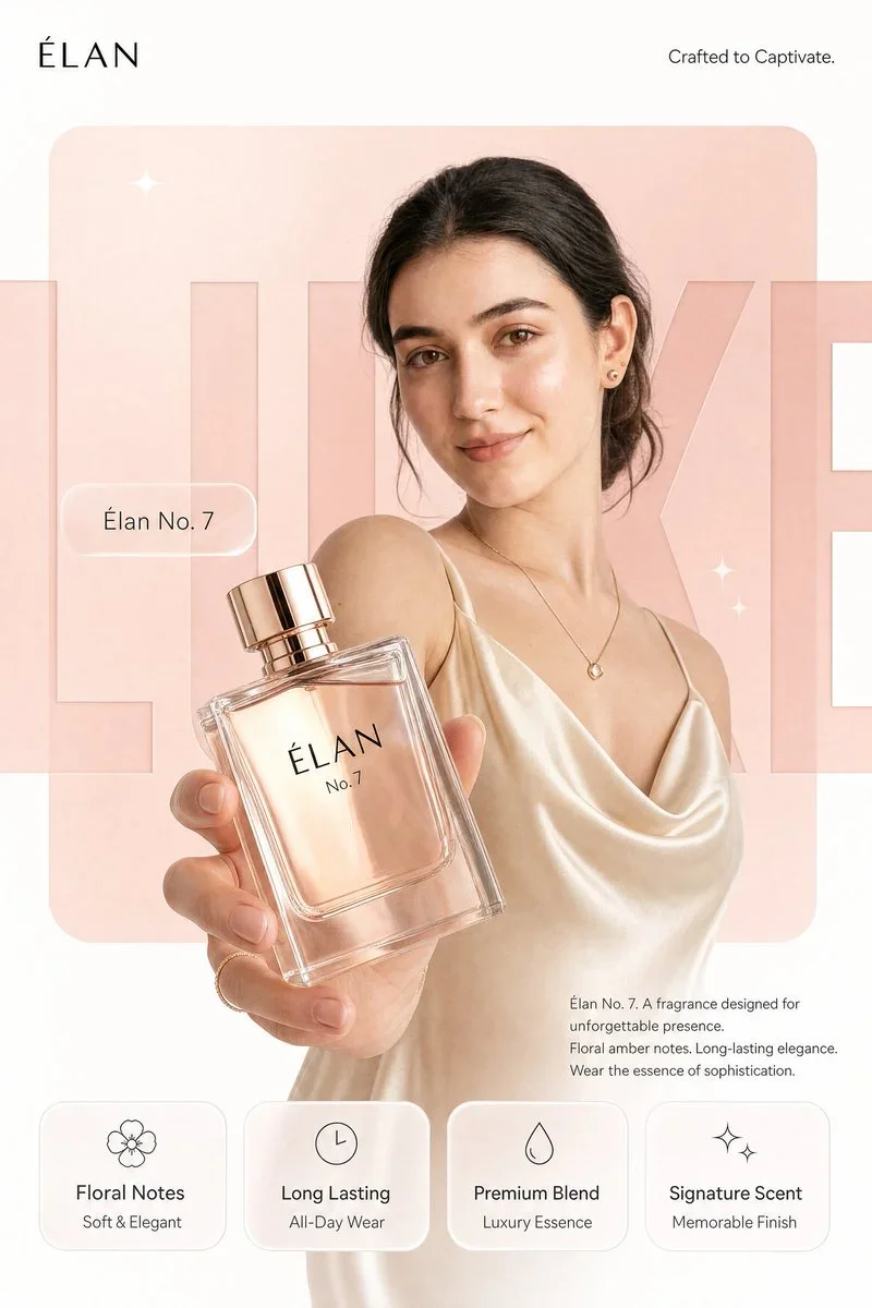
The prompt defines the subject, layout, negative space, and graphic treatment so the result can support a clear poster composition. Its strongest visual cues are minimal, neon, branding.
image prompt
Create an ultra-high-resolution minimalist line-art travel poster of {{destination}}, portraying the city as a stylish everyday urban scene rather than a tourist postcard.
CORE COMPOSITION:
- Central composition shows the city’s most iconic street, intersection, alley, tram street, or pedestrian avenue
- Foreground includes locals, commuters, cyclists, travelers, shoppers, students, café visitors
- People should naturally reflect the city’s local lifestyle and fashion culture
- Background filled with realistic local signage, cafés, restaurants, transportation signs, storefronts, and architectural details
- Landmarks should appear naturally integrated into everyday life, never exaggerated
- Include authentic local-language typography and culturally recognizable visual elements
- Large bold typography at the top center:
“{{destination}}”
- Subtitle below:
local language + country name
examples:
東京 JAPAN
서울 KOREA
ΚΟΛΩΝΙΑ GERMANY
STYLE:
ultra clean vector illustration,
Swiss modernist travel poster,
minimal line art,
monoline drawing,
mid-century editorial aesthetic,
architectural illustration,
Japanese graphic poster style,
precise geometric perspective,
extremely clean negative space,
premium travel branding aesthetic
LINE STYLE:
- monochrome line-based illustration only
- thin and highly precise linework
- minimal fill areas
- intricate city-map-like detail density
- rhythmic layering of signs, buildings, windows, and street objects
- visually dense yet highly organized composition
COLOR SYSTEM — VERY IMPORTANT:
- use only ONE main color + ONE background color
- automatically choose a color that best represents the city’s atmosphere
- monochrome silkscreen poster aesthetic
- no rainbow palettes
- no excessive neon
- color should reflect the city’s architecture, climate, nightlife, and cultural identity
Examples:
Tokyo → vivid red on warm ivory
Paris → deep navy on cream
New York → charcoal black on light gray
Kyoto → muted burgundy on warm cream
Hong Kong → teal blue on pale ivory
Santorini → Mediterranean blue on white
Cairo → desert sepia on sand beige
COMPOSITION:
- vertical poster layout
- frontal street-level perspective
- pedestrians crossing streets or moving naturally
- balanced urban rhythm and visual flow
- should feel like a premium city-brand campaign poster
MOOD:
stylish urban life,
calm but lively,
editorial travel magazine cover,
timeless city identity,
premium tourism campaign visual,
minimal yet highly detailed
TEXT QUALITY — EXTREMELY IMPORTANT:
- all typography must be readable and accurate
- no random characters
- no broken or distorted letters
- local signage should feel authentic and natural
- professional editorial typography alignment
OUTPUT:
- vertical poster composition
- 8K ultra detailed
- print-ready
- ultra sharp vector quality
Art direction controls: {{colorPalette}}, {{composition}}.
Tune the prompt, not the plumbing.
Every control comes from this prompt’s content schema. Changes stay in your browser and update instantly.
Customized prompt2957 characters
Create an ultra-high-resolution minimalist line-art travel poster of the intended destination, portraying the city as a stylish everyday urban scene rather than a tourist postcard.
CORE COMPOSITION:
- Central composition shows the city’s most iconic street, intersection, alley, tram street, or pedestrian avenue
- Foreground includes locals, commuters, cyclists, travelers, shoppers, students, café visitors
- People should naturally reflect the city’s local lifestyle and fashion culture
- Background filled with realistic local signage, cafés, restaurants, transportation signs, storefronts, and architectural details
- Landmarks should appear naturally integrated into everyday life, never exaggerated
- Include authentic local-language typography and culturally recognizable visual elements
- Large bold typography at the top center:
“the intended destination”
- Subtitle below:
local language + country name
examples:
東京 JAPAN
서울 KOREA
ΚΟΛΩΝΙΑ GERMANY
STYLE:
ultra clean vector illustration,
Swiss modernist travel poster,
minimal line art,
monoline drawing,
mid-century editorial aesthetic,
architectural illustration,
Japanese graphic poster style,
precise geometric perspective,
extremely clean negative space,
premium travel branding aesthetic
LINE STYLE:
- monochrome line-based illustration only
- thin and highly precise linework
- minimal fill areas
- intricate city-map-like detail density
- rhythmic layering of signs, buildings, windows, and street objects
- visually dense yet highly organized composition
COLOR SYSTEM — VERY IMPORTANT:
- use only ONE main color + ONE background color
- automatically choose a color that best represents the city’s atmosphere
- monochrome silkscreen poster aesthetic
- no rainbow palettes
- no excessive neon
- color should reflect the city’s architecture, climate, nightlife, and cultural identity
Examples:
Tokyo → vivid red on warm ivory
Paris → deep navy on cream
New York → charcoal black on light gray
Kyoto → muted burgundy on warm cream
Hong Kong → teal blue on pale ivory
Santorini → Mediterranean blue on white
Cairo → desert sepia on sand beige
COMPOSITION:
- vertical poster layout
- frontal street-level perspective
- pedestrians crossing streets or moving naturally
- balanced urban rhythm and visual flow
- should feel like a premium city-brand campaign poster
MOOD:
stylish urban life,
calm but lively,
editorial travel magazine cover,
timeless city identity,
premium tourism campaign visual,
minimal yet highly detailed
TEXT QUALITY — EXTREMELY IMPORTANT:
- all typography must be readable and accurate
- no random characters
- no broken or distorted letters
- local signage should feel authentic and natural
- professional editorial typography alignment
OUTPUT:
- vertical poster composition
- 8K ultra detailed
- print-ready
- ultra sharp vector quality
Art direction controls: deep cobalt, warm cream, and charcoal, a centered hero composition with deliberate negative space.
Useful structure, room to move.
The prompt defines the subject, layout, negative space, and graphic treatment so the result can support a clear poster composition. Its strongest visual cues are minimal, neon, branding.
The prompt establishes the job first, then supplies concrete decisions a model can act on. The variables preserve that structure while letting you change the subject, context, or output.
Reference Image Instruction: Use The Uploaded Product: Design a poster with a strong focal hierarchy, controlled palette, and intentional print character.
High-Fashion Surrealist Advertising Poster For Crocs: Design a poster with a strong focal hierarchy, controlled palette, and intentional print character.