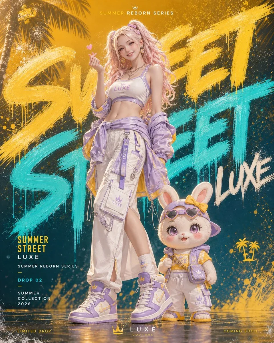
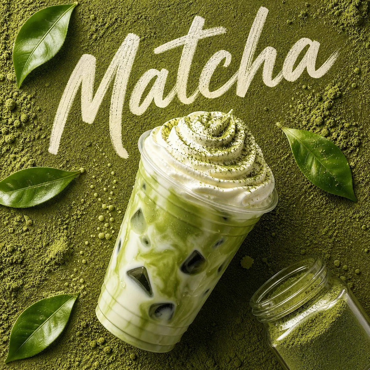
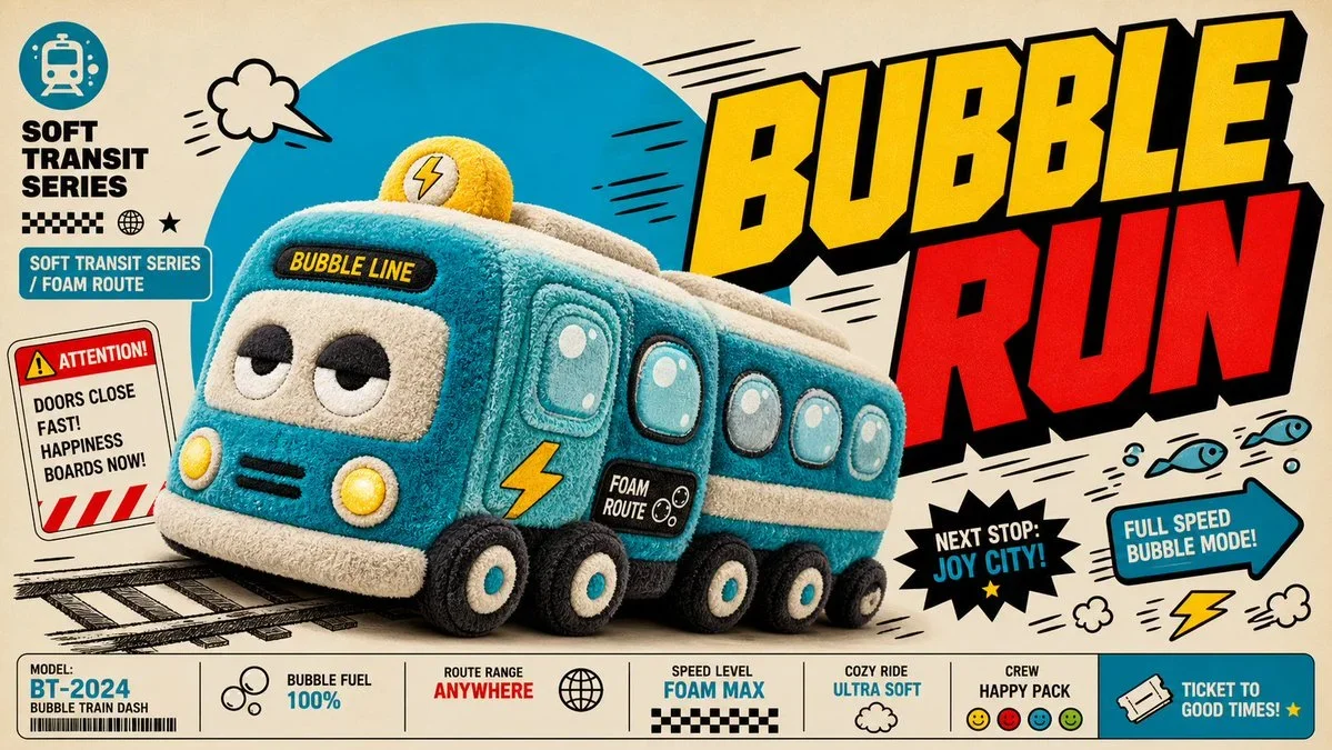
The prompt defines the subject, layout, negative space, and graphic treatment so the result can support a clear poster composition. Its strongest visual cues are anime, commercial, typography.
image prompt
Create a premium, highly believable Lootbox / Capsule Drop Ad for an imaginary drop called STARFALL RESERVE.
The goal is to make the drop feel addictive, valuable, visually irresistible, and immediately legible as a limited capsule release that players or collectors would obsess over. It should feel like an official monetized event, gacha banner, blind-box campaign, or capsule collection ad with strong rarity tension and hype.
Drop details:
- Drop name: STARFALL RESERVE
- Drop type: gacha banner
- Platform / game / universe: Velvet Orbit Online
- Core concept: a celestial capsule event featuring mythic character skins, orbital weapon effects, rare companion drones, and star-ranked cosmetic halos
- Main fantasy: pulling an ultra-rare mythic skin that instantly changes your status inside the game world
- Audience: gacha players, anime-game fans, collectors, character-skin obsessives, live-service event chasers
- Tone: premium, electric, cosmic, desirable, intense
- Cultural vibe: anime gacha prestige, live-service event hype, luxury digital goods
- Reality level: believable live game
Ad structure:
Build the visual like an official drop or summon campaign.
Include sections such as:
- drop title
- hero item, skin, or featured pull
- rarity tiers
- pull pool or featured lineup
- odds cues or rarity signals
- event duration
- optional price or currency
- optional “limited time” banner
- optional guaranteed reward note
- optional event iconography or pack art
- optional “open now” or “summon” CTA
For the copy, include:
- one strong drop headline
- 1 to 3 support lines
- short hype language that feels native to game or collector culture
- a balance between urgency, desirability, and system clarity
- wording that feels official, not generic
Include:
- a strong drop title treatment
- premium rarity hierarchy
- visually distinct featured items
- believable monetization cues
- strong event timing / scarcity signals
- polished platform-native UI language
- clear value fantasy
- instantly shareable collector-hype energy
Visual direction:
- Make the ad feel like a real live event people would spend money on immediately
- Emphasize rarity, exclusivity, emotional pull, and shiny desirability
- Balance commercial monetization design with polished visual worldbuilding
- Make it suitable for social launch posts, in-game store banners, event promo art, or collectible-culture content
- The result should look like a genuine limited-time drop from a successful platform or game
Art direction:
- Style: premium anime summon banner with cosmic live-event polish
- Color palette: midnight blue, silver, violet, pale gold, luminous white
- Typography feel: sleek event-display type with premium rarity labels
- Material feel: mobile game event banner and in-game summon screen
- Lighting or image mood: radiant cosmic glow with high-value item shine
- Background: celestial summon void with star fragments and orbit rings
Composition:
- Show the ad as one cohesive drop-campaign image
- Make the featured reward, rarity tiers, and event timing instantly readable
- Use real shop-banner hierarchy and monetization logic
- Make the drop feel tempting, limited, and systemically believable
- Make the final output feel like a premium fake loot-drop ad with viral potential
Output quality:
- ultra-detailed
- visually structured
- commercially believable
- culturally fluent
- polished drop-system styling
- strong hierarchy and spacing
- premium event-banner composition
- instantly shareable visual concept
Optional content blocks:
- pity guarantee note
- event countdown
- in-game currency icon
- mythic rarity badge
- preview carousel
- “summon now” CTA
Avoid:
- generic reward icons
- weak rarity logic
- fake-looking monetization cues
- cluttered banner design
- random typography choices
- amateur event aesthetics
- too much copy fighting the featured item
- obvious parody unless intentionally chosen
Art direction controls: {{colorPalette}}, {{composition}}, {{mood}}.
Tune the prompt, not the plumbing.
Every control comes from this prompt’s content schema. Changes stay in your browser and update instantly.
Customized prompt4078 characters
Create a premium, highly believable Lootbox / Capsule Drop Ad for an imaginary drop called STARFALL RESERVE.
The goal is to make the drop feel addictive, valuable, visually irresistible, and immediately legible as a limited capsule release that players or collectors would obsess over. It should feel like an official monetized event, gacha banner, blind-box campaign, or capsule collection ad with strong rarity tension and hype.
Drop details:
- Drop name: STARFALL RESERVE
- Drop type: gacha banner
- Platform / game / universe: Velvet Orbit Online
- Core concept: a celestial capsule event featuring mythic character skins, orbital weapon effects, rare companion drones, and star-ranked cosmetic halos
- Main fantasy: pulling an ultra-rare mythic skin that instantly changes your status inside the game world
- Audience: gacha players, anime-game fans, collectors, character-skin obsessives, live-service event chasers
- Tone: premium, electric, cosmic, desirable, intense
- Cultural vibe: anime gacha prestige, live-service event hype, luxury digital goods
- Reality level: believable live game
Ad structure:
Build the visual like an official drop or summon campaign.
Include sections such as:
- drop title
- hero item, skin, or featured pull
- rarity tiers
- pull pool or featured lineup
- odds cues or rarity signals
- event duration
- optional price or currency
- optional “limited time” banner
- optional guaranteed reward note
- optional event iconography or pack art
- optional “open now” or “summon” CTA
For the copy, include:
- one strong drop headline
- 1 to 3 support lines
- short hype language that feels native to game or collector culture
- a balance between urgency, desirability, and system clarity
- wording that feels official, not generic
Include:
- a strong drop title treatment
- premium rarity hierarchy
- visually distinct featured items
- believable monetization cues
- strong event timing / scarcity signals
- polished platform-native UI language
- clear value fantasy
- instantly shareable collector-hype energy
Visual direction:
- Make the ad feel like a real live event people would spend money on immediately
- Emphasize rarity, exclusivity, emotional pull, and shiny desirability
- Balance commercial monetization design with polished visual worldbuilding
- Make it suitable for social launch posts, in-game store banners, event promo art, or collectible-culture content
- The result should look like a genuine limited-time drop from a successful platform or game
Art direction:
- Style: premium anime summon banner with cosmic live-event polish
- Color palette: midnight blue, silver, violet, pale gold, luminous white
- Typography feel: sleek event-display type with premium rarity labels
- Material feel: mobile game event banner and in-game summon screen
- Lighting or image mood: radiant cosmic glow with high-value item shine
- Background: celestial summon void with star fragments and orbit rings
Composition:
- Show the ad as one cohesive drop-campaign image
- Make the featured reward, rarity tiers, and event timing instantly readable
- Use real shop-banner hierarchy and monetization logic
- Make the drop feel tempting, limited, and systemically believable
- Make the final output feel like a premium fake loot-drop ad with viral potential
Output quality:
- ultra-detailed
- visually structured
- commercially believable
- culturally fluent
- polished drop-system styling
- strong hierarchy and spacing
- premium event-banner composition
- instantly shareable visual concept
Optional content blocks:
- pity guarantee note
- event countdown
- in-game currency icon
- mythic rarity badge
- preview carousel
- “summon now” CTA
Avoid:
- generic reward icons
- weak rarity logic
- fake-looking monetization cues
- cluttered banner design
- random typography choices
- amateur event aesthetics
- too much copy fighting the featured item
- obvious parody unless intentionally chosen
Art direction controls: deep cobalt, warm cream, and charcoal, a centered hero composition with deliberate negative space, quiet and editorial.
Useful structure, room to move.
The prompt defines the subject, layout, negative space, and graphic treatment so the result can support a clear poster composition. Its strongest visual cues are anime, commercial, typography.
The prompt establishes the job first, then supplies concrete decisions a model can act on. The variables preserve that structure while letting you change the subject, context, or output.