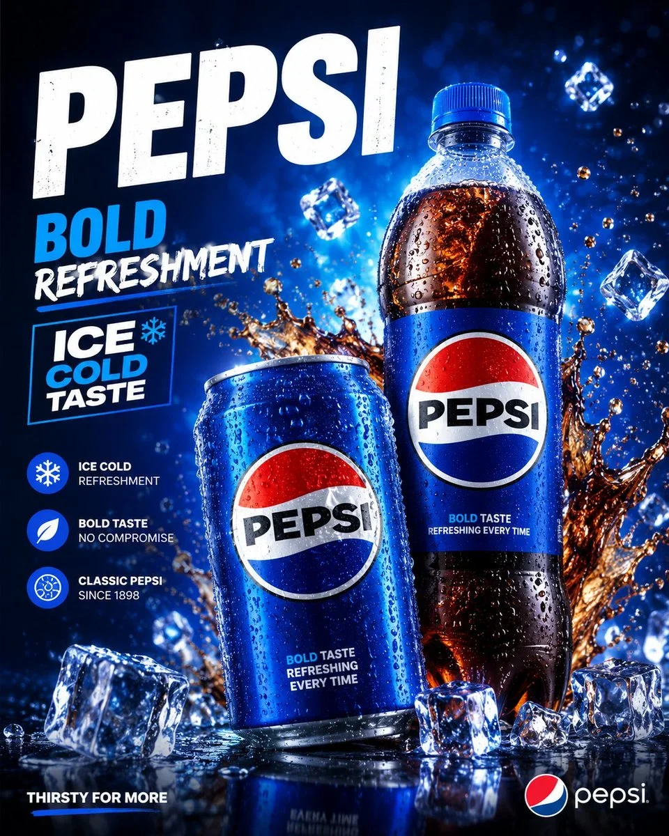
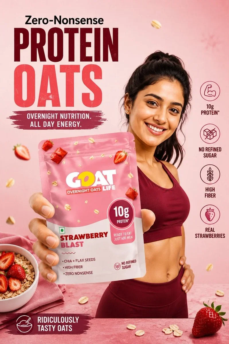
The prompt defines the subject, layout, negative space, and graphic treatment so the result can support a clear poster composition. Its strongest visual cues are close up, commercial, packaging.
image prompt
Please create a high-fidelity, unified visual system for an original fresh fruit e-commerce brand, titled "4-Board Fresh Fruit Brand Commercialization Proposal".
Note: This is not a four-grid collage nor a single image merging four contents. Each of the four images is an independent picture under the same brand system, to be generated sequentially. Generate only the current image each time, automatically continuing the brand visual DNA established previously, until all four are completed. The aspect ratio is uniformly vertical 3:4.
{{brandSettings}}
Brand Name: 枝上初红
English Auxiliary Name: FIRST RED ON THE BRANCH
Brand Type: High-end fresh red bayberry e-commerce brand / Summer fruit brand / Light gift fruit brand
One-line Positioning: Send the first taste of summer from the mountains to your hands.
Core Keywords: Red bayberry season, fresh-picked in season, direct from origin, cold chain preservation, sweet and sour burst, mountain rustic feeling, summer fruit gift, e-commerce commercialization
Target Audience: Urban families, young office workers, quality- and seasonal-conscious consumers, light gift users, e-commerce fruit buyers
Overall Style: Summer fruit e-commerce aesthetics × high-end realistic product photography × light fruit gift brand proposal
Main Colors: Bayberry deep red, fresh fruit red-purple
Secondary Colors: Leaf green, milky white, ice white, light gray-blue
Accent Colors: Dewdrop silver-gray, slight metallic light gold
Visual Elements: Bayberry grain texture, branches and leaves, fruit stems, mountain line drawing, morning dew, water droplets, ice sensation, orchard atmosphere, cold chain preservation symbols, summer refreshing vibe
Brand Slogan: Send the first taste of summer from the mountains to your hands.
{{ipSetting}}
Need a light IP, not just Logo. The IP is named "枝枝灵 / ZHI ZHI SPIRIT". It is not a big-eyed cartoon bayberry person, but a restrained, cute, lightly anthropomorphized brand fruit spirit identifier, which can appear as a small badge, small tag, small pendant, small sticker, small stamp, small ornament, or packaging guardian. It should embody the qualities of bayberry, leaves, and branches, being light and cute but not childish, not cheap, not overwhelming, and naturally integrated into the brand system and product system.
{{productLinesSkus}}
1. Taste Pack: 250g
2. Light Enjoy Pack: 500g
3. Family Pack: 1kg
4. Selected Gift Box: 2kg
5. Premium Fruit Gift Pack: Premium gift box edition
Supporting Contents: Fruit box inner tray, absorbent pad, ice pack, cold chain insulation bag, express outer box, handbag, brand card, orchard introduction card, consumption suggestion card, seal, sticker, hang tag, grade label
{{overallRequirements}}
1. The four images must clearly belong to the same brand system, with unified brand name, colors, typography temperament, graphic language, IP image, packaging logic, and product tone.
2. Not ordinary fruit posters or cheap promotion images, but a commercially viable, transmittable, reusable fresh fruit e-commerce brand system proposal.
3. Images must be highly realistic, with real fruit texture, real packaging material feel, real product photography feel, real cold chain and e-commerce scene feel.
4. Text should be as accurate as possible: brand name "枝上初红", English "FIRST RED ON THE BRANCH", IP name "枝枝灵" should be clear and correct, no garbled characters, no large meaningless small text.
5. IP must exist but be light, not childish cartoon, not like children's snack packaging.
6. Overall should be transparent, clear, fresh, with juice sense, summer sense, and also brand proposal sense and commercial sense.
{{image1BrandHeroBoard}}
This image sets the tone and is the first visual memory point.
Key display:
- Brand name "枝上初红"
- English auxiliary name "FIRST RED ON THE BRANCH"
- Brand slogan
- High-end fresh bayberry main packaging or gift box main visual
- Full, fresh, deep red, grainy, dewdrop real bayberry close-up
- Branches, leaves, fruit stems, mountain morning, light mist, water droplets and other atmospheric elements
- Light IP "枝枝灵" appearing as a badge, tag, small ornament, or brand identifier
- Core selling points: fresh-picked in season, direct from origin, cold chain preservation, sweet and sour burst
Requirements: More like a cover image / Hero Image, not an instruction manual; with a sense of appeal, freshness, high-end, and first glance appetite.
{{image2BrandIdentityIpSystemBoard}}
This image explains how the brand visual system and IP language are structured.
Key display:
- Brand logotype / Logo
- Brand color system
- Bayberry grain texture, branches, leaves, fruit stems, mountain line drawing, water droplets, ice graphics and other auxiliary visual language
- Light IP "枝枝灵" system: IP image, small badge, small pendant, sticker, hang tag, stamp, seal, simplified icons
- Specification label system
- Sweetness / fruit diameter / freshness / cold chain icon system
- Small application system: labels, stickers, seals, hang tags, cards
Requirements: Like a high-end brand identity proposal board, but not stiff, not childish; clear modules, complete information, with design sense and unity.
{{image3ProductPackagingSystemBoard}}
This image shows how the brand translates into actual products and packaging system.
Key display:
- Product matrix: 250g, 500g, 1kg, 2kg, premium fruit gift pack
- Fresh fruit packaging boxes, gift boxes, inner trays, absorbent pads, ice packs, insulation bags, handbags, cold chain outer boxes
- Brand cards, orchard introduction cards, consumption suggestion cards
- Seals, labels, hang tags, grade stickers
- Fresh fruit close-ups, fruit diameter grading or quality expression
- Light IP "枝枝灵" naturally integrated into packaging system
Requirements: Like a real ready-to-sell fresh fruit e-commerce brand product system, not just a pile of boxes; must show specification levels, packaging logic, and brand unity.
{{image4CampaignSalesScenarioBoard}}
This image shows the effect of the brand in real e-commerce and communication scenarios.
Key display:
- Mobile e-commerce homepage / product detail page main visual
- Social media grass-planting images / feed-style communication images
- Unboxing scene: opening the fruit box to see bayberries, ice packs, cards, etc.
- Cold chain delivery scene: outer box, delivery, unboxing at home
- Gift-giving scene / family sharing scene / summer afternoon tea scene
- Optional pop-up store / counter / display stand small scene
- Brand colors, packaging, IP symbols, product system remain consistent across different scenes
Requirements: More emphasis on real sales and communication scenarios than Image 3; not just simple packaging display, but complete e-commerce chain and brand application effect.
the intended negative requirements
No four-grid collage, no merging 4 images into one.
No cheap fruit promotional poster feel.
No low-quality e-commerce template feel.
No collage material feel.
No excessive traditional specialty product feel.
Do not make IP into a big-eyed cartoon bayberry person.
Not childish, low-age, cheap.
No fake CG staged feel.
No copying any existing brand or IP.
the intended execution method
First unify the brand visual DNA of "枝上初红", then generate in order:
Image 1: Brand Hero Board
Image 2: Brand Identity & IP System Board
Image 3: Product & Packaging System Board
Image 4: Campaign & Sales Scenario Board
Generate only the current independent image each time, automatically continuing the brand system established before, until all 4 are completed.
Tune the prompt, not the plumbing.
Every control comes from this prompt’s content schema. Changes stay in your browser and update instantly.
Customized prompt7637 characters
Please create a high-fidelity, unified visual system for an original fresh fruit e-commerce brand, titled "4-Board Fresh Fruit Brand Commercialization Proposal".
Note: This is not a four-grid collage nor a single image merging four contents. Each of the four images is an independent picture under the same brand system, to be generated sequentially. Generate only the current image each time, automatically continuing the brand visual DNA established previously, until all four are completed. The aspect ratio is uniformly vertical 3:4.
the intended brand settings
Brand Name: 枝上初红
English Auxiliary Name: FIRST RED ON THE BRANCH
Brand Type: High-end fresh red bayberry e-commerce brand / Summer fruit brand / Light gift fruit brand
One-line Positioning: Send the first taste of summer from the mountains to your hands.
Core Keywords: Red bayberry season, fresh-picked in season, direct from origin, cold chain preservation, sweet and sour burst, mountain rustic feeling, summer fruit gift, e-commerce commercialization
Target Audience: Urban families, young office workers, quality- and seasonal-conscious consumers, light gift users, e-commerce fruit buyers
Overall Style: Summer fruit e-commerce aesthetics × high-end realistic product photography × light fruit gift brand proposal
Main Colors: Bayberry deep red, fresh fruit red-purple
Secondary Colors: Leaf green, milky white, ice white, light gray-blue
Accent Colors: Dewdrop silver-gray, slight metallic light gold
Visual Elements: Bayberry grain texture, branches and leaves, fruit stems, mountain line drawing, morning dew, water droplets, ice sensation, orchard atmosphere, cold chain preservation symbols, summer refreshing vibe
Brand Slogan: Send the first taste of summer from the mountains to your hands.
the intended ip setting
Need a light IP, not just Logo. The IP is named "枝枝灵 / ZHI ZHI SPIRIT". It is not a big-eyed cartoon bayberry person, but a restrained, cute, lightly anthropomorphized brand fruit spirit identifier, which can appear as a small badge, small tag, small pendant, small sticker, small stamp, small ornament, or packaging guardian. It should embody the qualities of bayberry, leaves, and branches, being light and cute but not childish, not cheap, not overwhelming, and naturally integrated into the brand system and product system.
the intended product lines skus
1. Taste Pack: 250g
2. Light Enjoy Pack: 500g
3. Family Pack: 1kg
4. Selected Gift Box: 2kg
5. Premium Fruit Gift Pack: Premium gift box edition
Supporting Contents: Fruit box inner tray, absorbent pad, ice pack, cold chain insulation bag, express outer box, handbag, brand card, orchard introduction card, consumption suggestion card, seal, sticker, hang tag, grade label
the intended overall requirements
1. The four images must clearly belong to the same brand system, with unified brand name, colors, typography temperament, graphic language, IP image, packaging logic, and product tone.
2. Not ordinary fruit posters or cheap promotion images, but a commercially viable, transmittable, reusable fresh fruit e-commerce brand system proposal.
3. Images must be highly realistic, with real fruit texture, real packaging material feel, real product photography feel, real cold chain and e-commerce scene feel.
4. Text should be as accurate as possible: brand name "枝上初红", English "FIRST RED ON THE BRANCH", IP name "枝枝灵" should be clear and correct, no garbled characters, no large meaningless small text.
5. IP must exist but be light, not childish cartoon, not like children's snack packaging.
6. Overall should be transparent, clear, fresh, with juice sense, summer sense, and also brand proposal sense and commercial sense.
the intended image1 brand hero board
This image sets the tone and is the first visual memory point.
Key display:
- Brand name "枝上初红"
- English auxiliary name "FIRST RED ON THE BRANCH"
- Brand slogan
- High-end fresh bayberry main packaging or gift box main visual
- Full, fresh, deep red, grainy, dewdrop real bayberry close-up
- Branches, leaves, fruit stems, mountain morning, light mist, water droplets and other atmospheric elements
- Light IP "枝枝灵" appearing as a badge, tag, small ornament, or brand identifier
- Core selling points: fresh-picked in season, direct from origin, cold chain preservation, sweet and sour burst
Requirements: More like a cover image / Hero Image, not an instruction manual; with a sense of appeal, freshness, high-end, and first glance appetite.
the intended image2 brand identity ip system board
This image explains how the brand visual system and IP language are structured.
Key display:
- Brand logotype / Logo
- Brand color system
- Bayberry grain texture, branches, leaves, fruit stems, mountain line drawing, water droplets, ice graphics and other auxiliary visual language
- Light IP "枝枝灵" system: IP image, small badge, small pendant, sticker, hang tag, stamp, seal, simplified icons
- Specification label system
- Sweetness / fruit diameter / freshness / cold chain icon system
- Small application system: labels, stickers, seals, hang tags, cards
Requirements: Like a high-end brand identity proposal board, but not stiff, not childish; clear modules, complete information, with design sense and unity.
the intended image3 product packaging system board
This image shows how the brand translates into actual products and packaging system.
Key display:
- Product matrix: 250g, 500g, 1kg, 2kg, premium fruit gift pack
- Fresh fruit packaging boxes, gift boxes, inner trays, absorbent pads, ice packs, insulation bags, handbags, cold chain outer boxes
- Brand cards, orchard introduction cards, consumption suggestion cards
- Seals, labels, hang tags, grade stickers
- Fresh fruit close-ups, fruit diameter grading or quality expression
- Light IP "枝枝灵" naturally integrated into packaging system
Requirements: Like a real ready-to-sell fresh fruit e-commerce brand product system, not just a pile of boxes; must show specification levels, packaging logic, and brand unity.
the intended image4 campaign sales scenario board
This image shows the effect of the brand in real e-commerce and communication scenarios.
Key display:
- Mobile e-commerce homepage / product detail page main visual
- Social media grass-planting images / feed-style communication images
- Unboxing scene: opening the fruit box to see bayberries, ice packs, cards, etc.
- Cold chain delivery scene: outer box, delivery, unboxing at home
- Gift-giving scene / family sharing scene / summer afternoon tea scene
- Optional pop-up store / counter / display stand small scene
- Brand colors, packaging, IP symbols, product system remain consistent across different scenes
Requirements: More emphasis on real sales and communication scenarios than Image 3; not just simple packaging display, but complete e-commerce chain and brand application effect.
the intended negative requirements
No four-grid collage, no merging 4 images into one.
No cheap fruit promotional poster feel.
No low-quality e-commerce template feel.
No collage material feel.
No excessive traditional specialty product feel.
Do not make IP into a big-eyed cartoon bayberry person.
Not childish, low-age, cheap.
No fake CG staged feel.
No copying any existing brand or IP.
the intended execution method
First unify the brand visual DNA of "枝上初红", then generate in order:
Image 1: Brand Hero Board
Image 2: Brand Identity & IP System Board
Image 3: Product & Packaging System Board
Image 4: Campaign & Sales Scenario Board
Generate only the current independent image each time, automatically continuing the brand system established before, until all 4 are completed.
Useful structure, room to move.
The prompt defines the subject, layout, negative space, and graphic treatment so the result can support a clear poster composition. Its strongest visual cues are close up, commercial, packaging.
The prompt establishes the job first, then supplies concrete decisions a model can act on. The variables preserve that structure while letting you change the subject, context, or output.