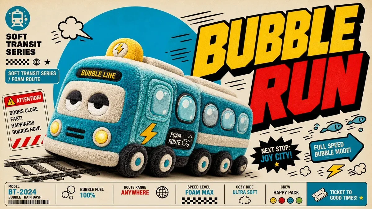
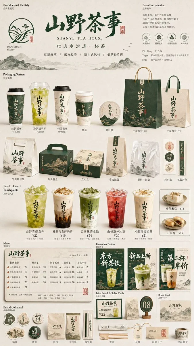
The prompt defines the subject, layout, negative space, and graphic treatment so the result can support a clear poster composition. Its strongest visual cues are minimal, food, commercial.
image prompt
Please create a high-aesthetic, high-completion 'Brand Packaging System Display' for the brand [品牌名称] and category [品牌类目]. This is not an ordinary e-commerce white background image, nor a single product image, but a packaging family display render with a sense of brand proposal, visual identity system, and commercial photography texture. The image needs to reflect 'unified implementation of the same brand on multiple packaging carriers', presenting a complete packaging system of a mature consumer brand.
【Aspect Ratio Requirements】The overall composition must be a fixed 4:5 vertical poster layout, with a clear vertical orientation. Horizontal, wide desktop displays, or overly scattered horizontal layouts are prohibited. The overall composition should follow poster reading logic: maintain breathing space at the top, the middle as the main visual focus of the brand packaging system, and the bottom arranged with auxiliary packaging, labels, and product bodies. The overall center of gravity should be concentrated, suitable for direct release as a brand display poster.
【Core Requirements】Automatically match the most reasonable and natural packaging combination and product form based on 【category】, and establish a unified brand visual system around 【brand name】. The image should select a small but representative set of packaging forms to compose a complete and refined brand packaging system, not pursuing quantity, but emphasizing primary-secondary hierarchy, brand unity, and display aesthetics. Reasonably select some of the following packaging types according to the category: shopping bags / carry bags, paper boxes / gift boxes / outer boxes, long boxes / single-item boxes / sets, packaging bags / envelopes / sample bags / soft bags, cups / bottles / jars / tube containers / spray bottles / pump bottles, labels / stickers / seals / hang tags / small cards, and the actual product bodies corresponding to the category.
【Category Adaptation Logic】Packaging forms and product forms need to be automatically matched according to 【category】, but not limited to a single direction. Refer to the following adaptation logic for free divergence: If the category is food / bakery / snacks / beverages, mainly paper bags, paper boxes, packaging bags, cups, food containers, stickers, seals, and actual product bodies; if the category is tea / coffee / drinks, mainly cups, bottles, canned packaging, carry bags, cup sleeves, seal stickers, gift boxes, etc.; if the category is beauty / skincare / cosmetics / perfume, mainly bottles, jars, tubes, boxes, gift boxes, handbags, sample packaging, etc.; if the category is fragrance / home / lifestyle, mainly aroma bottles, candle cups, packaging boxes, gift boxes, carry bags, hang tags, label cards, etc.; if the category is clothing / accessories / trendy toys / cultural creative, mainly packaging boxes, drawer boxes, dust bags, handbags, stickers, hang tags, accessory packaging, etc.; if the category is digital accessories / tools / small consumer goods, mainly hard boxes, outer packaging boxes, storage bags, instruction cards, stickers, envelopes, labels, etc. Overall must embody the effect of 'reasonable category, unified brand, systematic packaging'.
【Quantity and Density Control】Control the number of objects in the image, do not over-clutter or display all possible packaging forms. The overall effect should present a 'less but refined, complete but not crowded' brand packaging system. It is recommended to select the most representative packaging carriers for display: 1-2 large packaging items, 2-3 medium packaging items, 2-4 small packaging or auxiliary items, 1-3 actual product bodies, total visible elements suggested to be between 6-10. Packaging types should reflect hierarchical variation and system sense, but avoid excessive repetition of similar items. The image needs sufficient white space and breathing room to ensure each packaging is clearly visible, with clear primary and secondary, and comfortable placement. Better to have fewer but refined than to overcrowd for 'completeness'.
【Brand Visual System Requirements】All packaging must belong to the same brand system, uniformly using 【brand name】 as the core brand identification element. Overall, there should be consistent logo/emblem presentation, font style, graphic language, illustration language or pattern system, layout logic, color scheme, material and print texture. Brand tone, color direction, pattern elements, auxiliary graphics, and visual atmosphere should be automatically matched and reasonably diverged based on 【category】, not confined to any fixed style. Overall style should be unified, coordinated, and have brand recognition. It can be minimalist and high-end, natural and organic, modern and fashionable, light luxury and refined, young and fresh, artistic, trendy and individual, or classic and elegant, but must conform to the characteristics of 【category】 and present the design completion of a mature brand.
【Color Scheme Mechanism Requirements】The overall color scheme should not be fixed to a single combination, nor should highly similar main color systems appear repeatedly. Each generation should actively form different main color schemes and color relationships based on 【category】 and brand temperament, using 'controlled divergence' for color interpretation. Colors can be low-saturation natural colors, modern neutrals, light vintage colors, bright and fresh colors, light luxury dark tones, or artistic comprehensive color systems, but must maintain high-end, unified, restrained, and brand-feeling. Allow different visual temperaments each generation, such as cream white and caramel brown, mist gray blue and warm white, olive green and linen beige, wine red and cream white, cocoa brown and ivory white, charcoal gray and wheat gold, mist pink gray and off-white, navy blue and warm gray, etc., only as reference directions, not fixed templates. No fluorescent colors, no cheap high saturation, no messy out-of-control multi-color collage.
【Image Composition and Display Requirements】The image adopts the brand packaging family display logic, not messy stacking. Overall, it is a commercial studio scene, using a 3/4 slight top-down perspective or a front display angle with slight perspective, forming a layered, orderly, and prioritized packaging display. Composition reference logic: place 1-2 larger packaging in the background as visual support, such as handbags, large gift boxes, large outer boxes; arrange brand core packaging or main single-item packaging in the middle ground as the main visual focus; place smaller packaging, auxiliary packaging, labels, stickers, and actual product bodies in the foreground; at least one actual product should naturally interact with the packaging, such as product half-exposed, placed in front of the packaging, or displayed in combination with packaging; overall form a balanced and design-wise triangular or staggered composition. The image should be clean, with white space, not crowded, rich but restrained, using a limited and precise packaging combination to reflect the complete brand packaging ecosystem.
【Visual Style Requirements】Overall present high-end commercial photography texture and brand proposal feel, with a clean studio environment background, which can be white, warm white, light gray, or a minimalist background automatically matched according to brand tone. The image should emphasize realistic packaging material performance, clear paper creases, box structures, bottle/jar contours, label details, printing texture, embossing / gold stamping / matte / cotton paper texture / kraft paper texture and other material details, as well as unified and high-end color matching, exquisite modern clean brand visual language, and a strong sense of 'this is a complete set of brand packaging system'.
【Lighting Requirements】Use real commercial photography-level lighting, can be soft studio light, or natural side light with slight directionality. Need clear but restrained shadows to enhance three-dimensionality, spatial sense, and high-end feel. Overall light should be transparent, bright, clean, not dark, not cheap feel, not messy background.
【Final Effect Requirements】The final image should look like a packaging system display poster of a mature brand, a packaging family proposal image, or a brand visual implementation render, not a scattered product collage. Key highlights: fixed 4:5 vertical poster feel, brand unity, packaging family completeness, commercial photography feel, design proposal feel, category adaptability, and high aesthetic and visual completion.
Art direction controls: {{colorPalette}}, {{composition}}, {{mood}}.
Tune the prompt, not the plumbing.
Every control comes from this prompt’s content schema. Changes stay in your browser and update instantly.
Customized prompt8791 characters
Please create a high-aesthetic, high-completion 'Brand Packaging System Display' for the brand [品牌名称] and category [品牌类目]. This is not an ordinary e-commerce white background image, nor a single product image, but a packaging family display render with a sense of brand proposal, visual identity system, and commercial photography texture. The image needs to reflect 'unified implementation of the same brand on multiple packaging carriers', presenting a complete packaging system of a mature consumer brand.
【Aspect Ratio Requirements】The overall composition must be a fixed 4:5 vertical poster layout, with a clear vertical orientation. Horizontal, wide desktop displays, or overly scattered horizontal layouts are prohibited. The overall composition should follow poster reading logic: maintain breathing space at the top, the middle as the main visual focus of the brand packaging system, and the bottom arranged with auxiliary packaging, labels, and product bodies. The overall center of gravity should be concentrated, suitable for direct release as a brand display poster.
【Core Requirements】Automatically match the most reasonable and natural packaging combination and product form based on 【category】, and establish a unified brand visual system around 【brand name】. The image should select a small but representative set of packaging forms to compose a complete and refined brand packaging system, not pursuing quantity, but emphasizing primary-secondary hierarchy, brand unity, and display aesthetics. Reasonably select some of the following packaging types according to the category: shopping bags / carry bags, paper boxes / gift boxes / outer boxes, long boxes / single-item boxes / sets, packaging bags / envelopes / sample bags / soft bags, cups / bottles / jars / tube containers / spray bottles / pump bottles, labels / stickers / seals / hang tags / small cards, and the actual product bodies corresponding to the category.
【Category Adaptation Logic】Packaging forms and product forms need to be automatically matched according to 【category】, but not limited to a single direction. Refer to the following adaptation logic for free divergence: If the category is food / bakery / snacks / beverages, mainly paper bags, paper boxes, packaging bags, cups, food containers, stickers, seals, and actual product bodies; if the category is tea / coffee / drinks, mainly cups, bottles, canned packaging, carry bags, cup sleeves, seal stickers, gift boxes, etc.; if the category is beauty / skincare / cosmetics / perfume, mainly bottles, jars, tubes, boxes, gift boxes, handbags, sample packaging, etc.; if the category is fragrance / home / lifestyle, mainly aroma bottles, candle cups, packaging boxes, gift boxes, carry bags, hang tags, label cards, etc.; if the category is clothing / accessories / trendy toys / cultural creative, mainly packaging boxes, drawer boxes, dust bags, handbags, stickers, hang tags, accessory packaging, etc.; if the category is digital accessories / tools / small consumer goods, mainly hard boxes, outer packaging boxes, storage bags, instruction cards, stickers, envelopes, labels, etc. Overall must embody the effect of 'reasonable category, unified brand, systematic packaging'.
【Quantity and Density Control】Control the number of objects in the image, do not over-clutter or display all possible packaging forms. The overall effect should present a 'less but refined, complete but not crowded' brand packaging system. It is recommended to select the most representative packaging carriers for display: 1-2 large packaging items, 2-3 medium packaging items, 2-4 small packaging or auxiliary items, 1-3 actual product bodies, total visible elements suggested to be between 6-10. Packaging types should reflect hierarchical variation and system sense, but avoid excessive repetition of similar items. The image needs sufficient white space and breathing room to ensure each packaging is clearly visible, with clear primary and secondary, and comfortable placement. Better to have fewer but refined than to overcrowd for 'completeness'.
【Brand Visual System Requirements】All packaging must belong to the same brand system, uniformly using 【brand name】 as the core brand identification element. Overall, there should be consistent logo/emblem presentation, font style, graphic language, illustration language or pattern system, layout logic, color scheme, material and print texture. Brand tone, color direction, pattern elements, auxiliary graphics, and visual atmosphere should be automatically matched and reasonably diverged based on 【category】, not confined to any fixed style. Overall style should be unified, coordinated, and have brand recognition. It can be minimalist and high-end, natural and organic, modern and fashionable, light luxury and refined, young and fresh, artistic, trendy and individual, or classic and elegant, but must conform to the characteristics of 【category】 and present the design completion of a mature brand.
【Color Scheme Mechanism Requirements】The overall color scheme should not be fixed to a single combination, nor should highly similar main color systems appear repeatedly. Each generation should actively form different main color schemes and color relationships based on 【category】 and brand temperament, using 'controlled divergence' for color interpretation. Colors can be low-saturation natural colors, modern neutrals, light vintage colors, bright and fresh colors, light luxury dark tones, or artistic comprehensive color systems, but must maintain high-end, unified, restrained, and brand-feeling. Allow different visual temperaments each generation, such as cream white and caramel brown, mist gray blue and warm white, olive green and linen beige, wine red and cream white, cocoa brown and ivory white, charcoal gray and wheat gold, mist pink gray and off-white, navy blue and warm gray, etc., only as reference directions, not fixed templates. No fluorescent colors, no cheap high saturation, no messy out-of-control multi-color collage.
【Image Composition and Display Requirements】The image adopts the brand packaging family display logic, not messy stacking. Overall, it is a commercial studio scene, using a 3/4 slight top-down perspective or a front display angle with slight perspective, forming a layered, orderly, and prioritized packaging display. Composition reference logic: place 1-2 larger packaging in the background as visual support, such as handbags, large gift boxes, large outer boxes; arrange brand core packaging or main single-item packaging in the middle ground as the main visual focus; place smaller packaging, auxiliary packaging, labels, stickers, and actual product bodies in the foreground; at least one actual product should naturally interact with the packaging, such as product half-exposed, placed in front of the packaging, or displayed in combination with packaging; overall form a balanced and design-wise triangular or staggered composition. The image should be clean, with white space, not crowded, rich but restrained, using a limited and precise packaging combination to reflect the complete brand packaging ecosystem.
【Visual Style Requirements】Overall present high-end commercial photography texture and brand proposal feel, with a clean studio environment background, which can be white, warm white, light gray, or a minimalist background automatically matched according to brand tone. The image should emphasize realistic packaging material performance, clear paper creases, box structures, bottle/jar contours, label details, printing texture, embossing / gold stamping / matte / cotton paper texture / kraft paper texture and other material details, as well as unified and high-end color matching, exquisite modern clean brand visual language, and a strong sense of 'this is a complete set of brand packaging system'.
【Lighting Requirements】Use real commercial photography-level lighting, can be soft studio light, or natural side light with slight directionality. Need clear but restrained shadows to enhance three-dimensionality, spatial sense, and high-end feel. Overall light should be transparent, bright, clean, not dark, not cheap feel, not messy background.
【Final Effect Requirements】The final image should look like a packaging system display poster of a mature brand, a packaging family proposal image, or a brand visual implementation render, not a scattered product collage. Key highlights: fixed 4:5 vertical poster feel, brand unity, packaging family completeness, commercial photography feel, design proposal feel, category adaptability, and high aesthetic and visual completion.
Art direction controls: deep cobalt, warm cream, and charcoal, a centered hero composition with deliberate negative space, quiet and editorial.
Useful structure, room to move.
The prompt defines the subject, layout, negative space, and graphic treatment so the result can support a clear poster composition. Its strongest visual cues are minimal, food, commercial.
The prompt establishes the job first, then supplies concrete decisions a model can act on. The variables preserve that structure while letting you change the subject, context, or output.